The strategy behind my website re-design
And how you can level up your own.
This week, I've given myself a Creative Business Audit. (Sometimes you need a dose of your own medicine.)
My website (and my business) is an ever-evolving thing. Every time I shift focus in my business, I update my website to match it. And my business has been slowly pivoting over the past few months to incorporate more of the stuff I did before starting my art business three years ago: creative business coaching, copywriting, and web design.
And so, it was time for another website overhaul. And I thought:
Why not let you in behind the scenes, and walk you through my strategy, while also giving you my best tips for increasing the effectiveness of your website?
So, pull up a chair, grab a beverage, and let's dive in.
The very first thing I asked myself - the thing that always, always has to come first - is: "Who is my ideal client? Who am I talking to? And what can I do for them?"
It’s is the first thing I look at with my coaching clients, and it's always at the back of my mind when updating my website. The more "me"-focused my website it, the worse it performs. The more spot-on, ideal customer-focused, the better my email signups and sales.
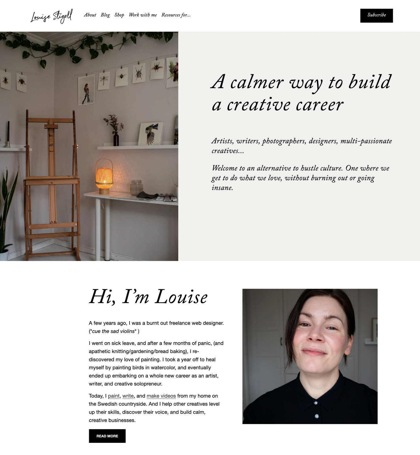
And so my new homepage is centered around just the type of person I serve, and speaking to their core needs and wants.
The space "above the fold" - the screen you first see when you land on a website, without having to scroll - is the most important real-estate on a site. It's the first impression someone gets of you. My main priority there is to immediately make the visitor feel seen and know they're in the right place. And so the language isn't about me at all, it's about them.
But I immediately follow it up with a short bio and a photo of me. If the first question we have when landing on a website is "Is this for me?", then the second one is "Who's behind this?" And if you run a solo business, especially as a creative, and especially when selling services - we need to see your face.
The third decision I've made is to completely ditch lead magnets and email welcome sequences in my business.
For now.
As an experiment.
It feels pretty radical, but I have a hypothesis: I think we're all growing tired and jaded when it comes to email marketing, as consumers. Like, we know the drill: Whenever we land on someone's website, and they have a bunch of free stuff for us, we know they'll need our email address in return. And that we will then end up in one of their email sequences, or get their regular newsletter. Which we may or may not be interested in.
I don't know how many times I've joined an email list just to get the freebie, and then immediately been like "kay, thanx, BYE". (Hands up, everyone who's guilty of the same?)
The fact is: a great lead magnet might get you a lot of subscribers. But a lot of those subscribers might not be all that interested in being on your email list. And if they don't stay on your email list, you'll have little chance of ever selling anything to them in the future.
Having done email marketing both with and without a lead magnet these recent years, my experience is that I get more quality engagement and relationships when I don't use them. Whenever someone joins my list now, I know they're doing it because they're genuinely interested in what I have to say. And I much prefer that.
…But I still want to offer a bunch of free resources to my people. So I figured, "Hey, why not take all of the stuff I would have put on the other side of an email signup, and put it on separate landing pages on my site?" That way, people can self-identify, pick the resources that appeal to them, and take as much of it as they need, no strings attached.
And if they enjoy the content, they're welcome to also subscribe to my newsletter.
No bribes needed.
Because if someone doesn't really want to be on my email list? Then I don't want them on it.
Isn't that a refreshing thought?
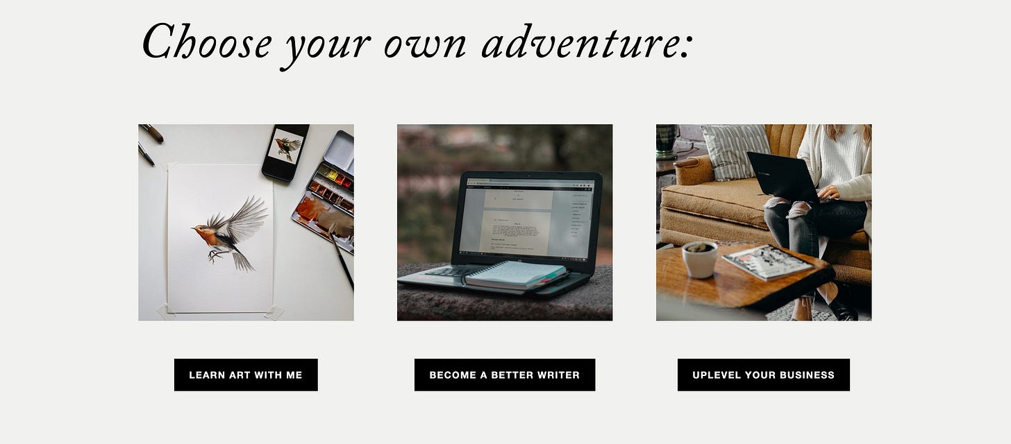
I have three landing pages now. One for artists, one for writers (which will get more content after summer), and one for creative businesses. Each one contains hand-picked content and free and paid offerings, and will be gradually expanded as I create more stuff.
I'm excited to see how this goes. I think my hypothesis might be correct, because I haven't worked with lead magnets and welcome sequences since last summer/fall - just with freely available content, weekly newsletters, and the one welcome email Substack allows me to automate - and my business has still really taken off during this time.
Most importantly, if feels good to me.
Moving on to the next part of the home page, which is the "Start here" section.
One of the most common mistakes I see on websites is too much information and too many options all at once. There are messages and links and images and calls-to-action everywhere, and as a visitor, you get overwhelmed and confused. You're not sure where to even begin.
That's why I love "Start here" sections, that guide the visitor through the site content in a logical way.
Another thing I love and highly recommend to all creatives is to have offerings in different price categories. Some free, some affordable, and some pricier. It's a great way to slowly build trust overtime with your customers. They can dip their toe in with something cheap, and if they like that, they're so much more likely to want one of your more premium offerings.
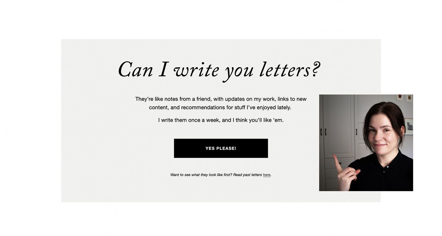
And finally, on pretty much ALL of the landing pages on my website, I finish with a newsletter pitch.
I don't put it first, or in a pop-up, because then it's just going to annoy people. They haven't yet decided if they like me and want to subscribe to me. I need to first earn their trust, which is why I prefer to pitch my newsletter or offerings at the end of my videos or podcast episodes, or blog posts, or web pages.
The second thing to note is that it's a pitch, not an anonymous-looking sign-up box. I tell people exactly what they're getting by subscribing, and why they might want to. This is so important. No one wants to "subscribe to a newsletter". They want stories, advice, inspiration, early invites, discounts, first dibs, behind-the-scenes, and other perks. They want to know exactly what they're getting. The best email pitch, in my opinion, is honesty. Simply tell people exactly what to expect.
Better yet, show them. What I love so much about Substack (and other similar email services) is that there's an archive of all of my past newsletters. This remedies that anxiety we always get when giving someone our email address. "Will they spam me? Will they bore me? Will this be relevant and worth my time?"
Another change I've made is to de-clutter my main navigation. All of the "me" stuff - my bio, my art, my stories, my contact info - has moved to an About folder to not take up as much space. The rest of the buttons serve to quickly guide the visitor to where they want to go, and avoid overwhelming them with too many options. And the main call-to-action in the menu is "Subscribe", because that's the primary goal of my whole website: turn a casual visitor into an email friend. The equivalent of inviting them over to my place for coffee.
I've also updated my About page, which now includes a "long version" of my story, complete with Polaroid photos. Instead of drip-feeding someone my story via an email sequence, people can just read the whole thing there.
And, my Creative Business Audit has evolved and gotten a new landing page. There are now two versions of this service:
An Audit, where I analyze someone's entire business and give personalized feedback and advice.
And an advanced Audit + Makeover, that also includes new design- and copy mock-ups for their website, with notes and explanations. This is the service I originally called "Copy Makeover", but I realized that copy exists in a context. And it's much more valuable for my clients to see new copy suggestions in combination with new visuals, explanations, and strategic advice. (So, you whose Copy Makeover applications I've chosen as my pro bono projects: this is what you're getting now. 🥳 Like being upgraded to business class.)
I'm having so much fun with these Audits and Makeovers, and have received lovely feedback and testimonials so far. Thank you for trusting in me and inviting me into your business this way. I feel honored, and inspired. 🖤
Well, there you have it! The full strategy behind my website design, and lots of useful tips to think about the next time you're tinkering with yours.
It's been a fun, but hectic week. I'm off to the basement gym, and then I'm going to crack open a kombucha and go play Subnautica all evening...
With love,
Some favorite things lately:
Ash Ambirge: "Is Your Niche Making You Miserable?"
"How do you build a brand, a reputation, a name for yourself if you’re doing different ‘projects?’ Or, the real question on the tip of every cliché business coaches tongue: HOW DO YOU FIND YOUR NICHE???
The answer for me has been simple: My body of work is connected together by a unifying theme, not a unifying product.”
Spot. On.
This article, on Trend Mill, on why we all kind of hate the internet now:
"Click off an advert here, only to have a new one pop up as you scroll. Huge areas of white space that are really video ads struggling to load. Then, a chatbot pops up to ask if you need help (and if you engage with them, the advice is the opposite of helpful). The popup windows offering you shitty PDF guides in return for your email address. Then, there is a post that is just a disguised sponsored post. Pages stuffed with affiliate links (DON’T GET ME STARTED ON RECIPE WEB PAGES.)"
😂...😭
You've probably heard about how Adobe is now joining the fun and using A.I. to exploit creatives. It’s such a trendy thing to do:
I've already abandoned Premiere Pro for DaVinci Resolve (a free video editing software). Now I decided to take the final step, and replace Photoshop with Affinity Photo. Bye bye Adobe, and your vampiric subscription models. 👋🏻
This article, on the birdwatchers of Palestine.
(Thanks to https://theolivetreesandthemoon.substack.com/ for sharing this.)
Maiya Sykes, one of the best voices on YouTube, singing "Boulevard Of Broken Dreams":
If you enjoy my writings, consider subscribing. Become a premium subscriber to get access to the full archive + community. Your support means a lot to me. 🖤
I am a watercolor wildlife artist by trade. You can view my original paintings and prints for sale here.
If you're a beginner artist, you might enjoy my self-paced courses on drawing and watercolor painting.
If you run a creative business and are tired of the social media hustle, I have a workbook called Calm Marketing you might find useful. I also offer personalized business advice via my Creative Business Audit. It’s like a high-powered coaching session, but super-affordable, and delivered via pdf.


Love this, Louise! I love your brand SO much!! I guess, I'm your ideal client…? 🫠 it’s a fine balance between a personal brand that is authentic and a website that is made with the user in mind, and you do this so beautifully 🩷 Your personality really shines through all your work 🩷
Re: Adobe: that’s interesting; I use FCP and contemplated on DaVinci, although it’s not free if you want more things with it.
What do you use instead of Illustrator? (I can’t get on with Figma )
Hi Louise! I found you on YouTube and have been enjoying your videos! Your website is so simple and calming, just like your title. I learned about your switch from social networking platforms to email marketing, and it really inspired me to explore Substack. After trying to figure out which platform would work for me (not liking most of them and leaving them behind), I finally decided to start on Substack too. Congratulations on your new website—I hope your new strategy brings you great success!